-
Stakeholder Interview
Market Research
User Interviews
-
User Journey
User Flow
Archetypes
Insights
-
How Might We’s
Brainstorming
Sketches
Wireframes
Testing
-
Prototype
Hi-fi wireframes
Usability Tests
Iterations
Hand Off

How can we boost audience engagement while making sustainable efforts more fun and engaging?

Exploring the Problem
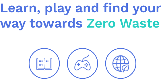
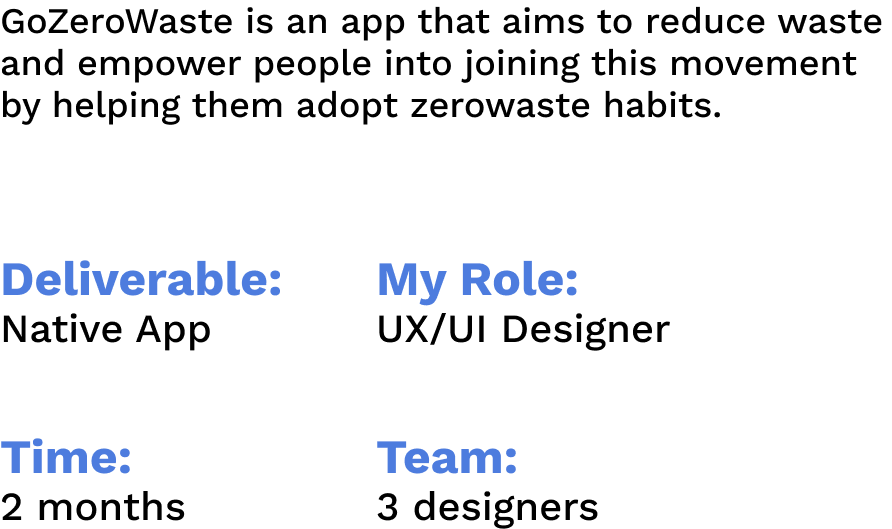
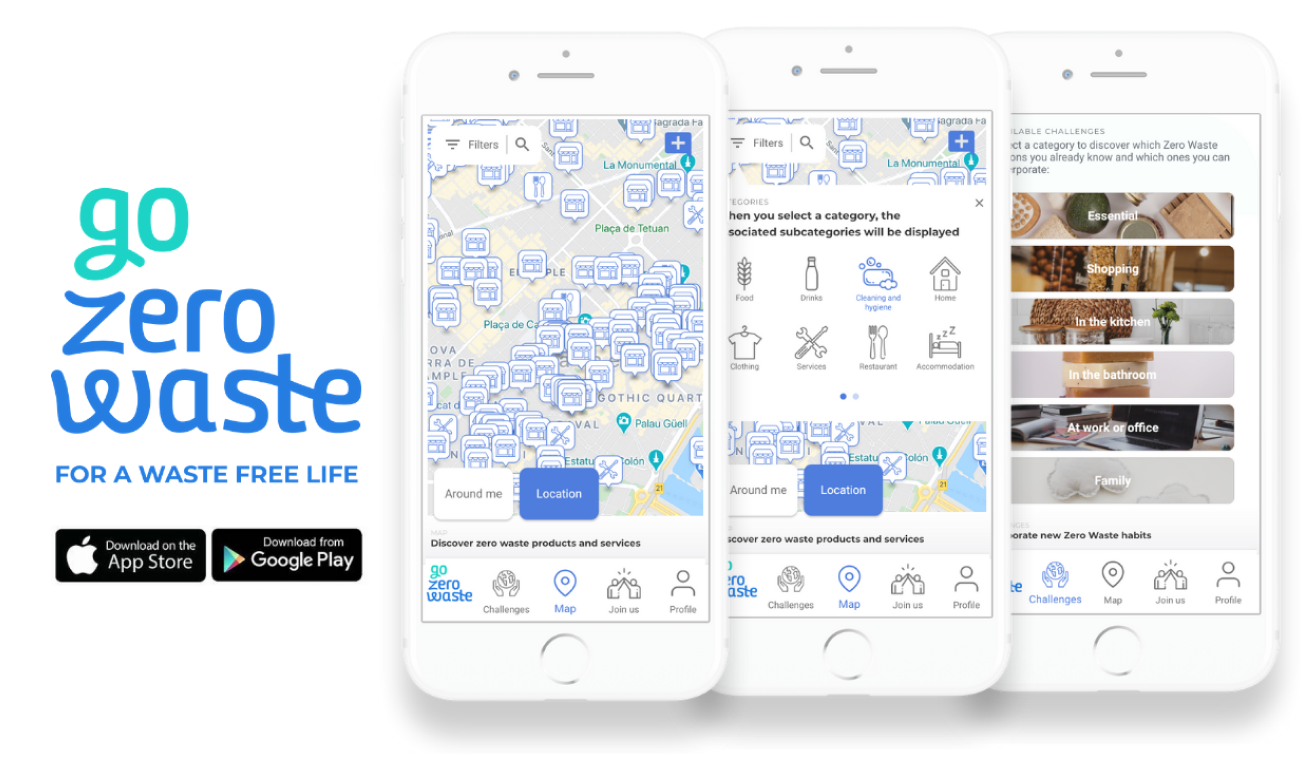
The Go Zero Waste App has two main features:
Interactive Map: The interactive map can be used to find local zero waste shops and products
Zero waste activities section: The activities are meant to encourage users to adopt more sustainable habits.
Stakeholder Interview
I scheduled an interview with the CEO of the company, Magda Cebrian, to better understand what her vision for the redesign of the app would be and these were the highlights:
Gamification: Gamify the adoption of zero waste habits to make the app more fun and engaging.
Aesthetics: Improve the overall look and feel of the app.
Boost audience engagement: Add a community element to the app through local zero waste events or sharing with friends.

Quantitative Research
I surveyed 58 people within our target audience and these were the driving factors that we gathered:
What is stopping people from adopting a zero-waste lifestyle?
46% Lack of time/organization
22% Lack of motivation
32% Lack of Knowledge
Qualitative Research
I conducted 7 user interviews and here are the insights some of which confirmed our assumptions and others which were new. The high level insights we decided to focus on are the following:

“It’s a lot of work” - Users feel frustrated because they think a zero waste lifestyle requires too much effort and planning.

“I do what I can but I wish I knew other ways I could help” - Users lack knowledge on the ways they could adopt zero waste.

“It’s discouraging to see that the progress is slow and others don’t follow”- Users feel that unless there are more people involved, their actions won’t be enough.
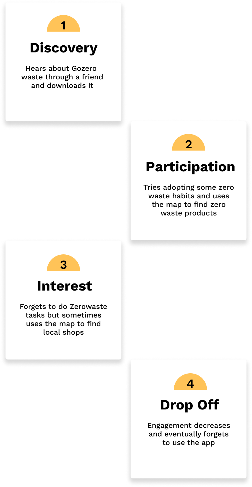
User Journey
Using data collected from previous research rounds, I designed a User Journey to visualize how users were interacting with the current app in hopes of finding improvement opportunities.
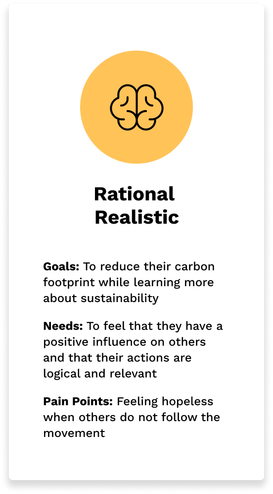
Acquiring new habits is complicated and I realized that there are patterns of behavior that are not user specific but rather culturally and psychologically broader which is why I used archetypes Instead of user personas. I grouped our users into 3 archetypes all of which had different goals, needs and pain points.
Archetypes


How Might We’s
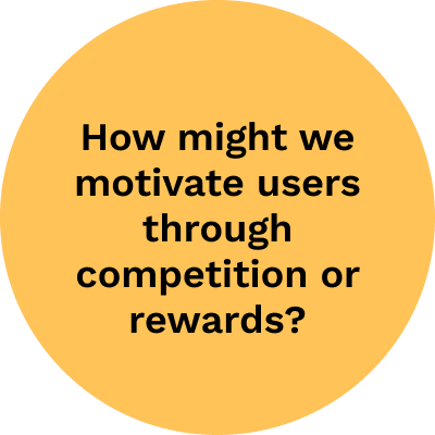
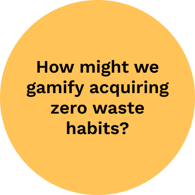
After understanding who our users were and their needs we created How Might We statements focusing on our three archetypes’ goals in mind. The following statements were the ones we prioritized:


Solutions

After several ideation rounds we managed create 3 solution areas where user experience could be improved while addressing our 3 archetypes’ needs, goals, and pain points.
Low-fi Wireframes

High-fi Wireframes


Home Updates

Local challenges and events section to foster community
Personalized experience from the start
Visible point system incentivizing the user to engage
Gamification Updates

Old design felt like a “To Do” list, new design is gamified
Challenges with streak incentives to motivate users
Fun and friendlier look and feel
What’s new?
Profile Page

Personalized profile with achievement and rewards sections for users to track their actions and swap their points for zero waste offers.
Learning Content

Users are able to learn interesting facts regarding zero waste and the impact they have each step of the way.
Iterations
I conducted 7 user tests and made some important iterations in order to improve the overall experience and aesthetics of the designs. These were the main areas we targeted:
Accessibility: We realized that some of the font colors were not visible to some of the users so we darkened the fonts where it was necessary.
Consistency: Some of the icons and images were not consistent and made the app look messy.
Tone: We added more system feedback where needed in order to guide and welcome the user throughout their experience.
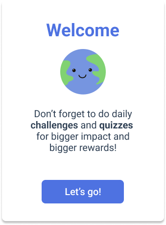
The Prototype
The task the user had accomplish for this flow was:
Complete the onboarding and create a profile
Start a daily challenge and complete it
Check their profile to see how many points they have.
Next steps:
Create your own challenge: Continue developing the local challenges section and add a feature to create your own challenge and share with friends.
Growth: Continue partnering with local businesses to help promote zero waste offers.